
Without a doubt, there is a proliferation of bad graphic design in the world. From the signage of a locally owned business to poorly conceived online ads, we are constantly inundated with shoddy graphic design—so much so, that many of us are confused as to the difference between good and bad graphic design. While my grievances are too long to list here, let’s talk about 5 tacky design “conventions” that annoy me to death.
Click Here to Learn About the Psychology of Fonts
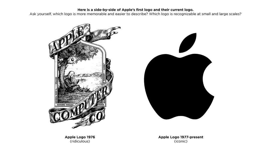
Complexity for the sake of itself.
What do I mean when I say “for the sake of itself”? One of the most important aspects of graphic design is to clearly communicate a message to an audience without confusing them. Graphic design isn’t the Sistine Chapel, it’s commercial art. We all desire to create something visually impressive, but it can’t come at the expense of a clear communication. All too often, designers feel the need to imbue a design with too much unnecessary detail and, as a result, the message gets lost. Too many colors means your design doesn’t actually have a color scheme. Too many complex shapes comprising your logo means it may have trouble translating across various media and sizes. All of this unnecessary detail simply adds up to poor design, not the desired “awesome” visual.
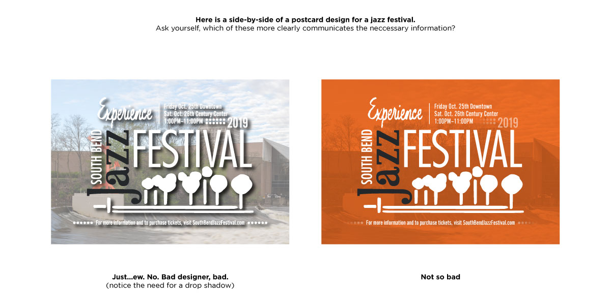
Ghosted full-color background photos.
So yeah, this gripe is essentially an extension of disliking unnecessary visual complexity, but it’s such a pervasive and tacky convention I thought I’d call it out specifically. Whenever I see text that is forced to compete visually with an ill-conceived, washed-out, colorful background image, I want to cringe. Can we stop doing this already? Thank you. (To be fair, I don’t mind text that is on top of a nice monochromatic photograph…as long as it’s handled tastefully).
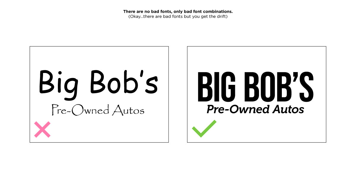
Bad font combinations.
No graphic design complaint list would be complete without discussing fonts. Usually this topic focuses on a single font that everyone hates—whether it’s simply overused or just ugly, everyone has a font they can’t stand (we’re looking at you comic sans). That’s all well and good, but I find every font has its place if properly used. Comic sans is fine for comic strips, and papyrus is pretty good for anything that has to do with the ancient near east. What really bothers me is bad font combinations. When a designer uses two otherwise good fonts to create an abomination of combination, it is truly annoying. Think about how much you dislike comic sans and papyrus. Now imagine seeing them in combination on the same design…non-ironically…to sell used cars.
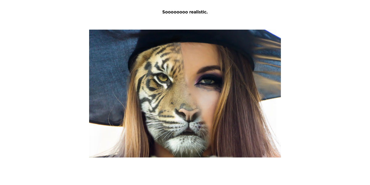
Obvious Photoshop composite images.
Photoshop composites are an unavoidable fact of life, as most people don’t have the budget to stage an extravagant photoshoot to execute their vision. But, if you’re going to go the composite route, please do it right. It’s not enough to just cut an element out from one photograph and place it into another photograph. Why? Because it looks like a scrapbook, not a realistic scene. It’s often said that makeup looks best when you can’t even tell someone is wearing it, I feel the same way about Photoshop composites. When creating a composite image, take the time and effort to help me suspend disbelief.
Obvious drop shadows
As with Photoshop composites, drop shadows are often an unavoidable fact of life. Also, as with composites and makeup, drop shadows are best used when I can’t tell you’re using a drop shadow. At least try not to hit me in the face with it. Strong drop shadows are a design crutch that should be avoided when possible. I’d even go as far as to say that drop shadows are the comic sans of the effects world.


