
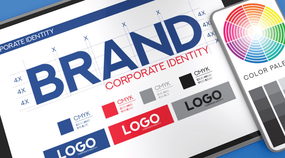
Let’s talk about color. I like color. I love color. BUT. But, too much color in a logo (or any design for that matter) can easily overwhelm and undermine the intended visual focus.
What Data Matters to Your Web Traffic?
Click Here to Learn!
A general rule of thumb that most designers strive to live by is to not use more than three colors in a logo design unless there is a sound conceptual reason to introduce more color. There’s a very common tendency when developing a brand to want to throw the kitchen sink at it—to want to be so creative as to overthink the process—to lose sight, in simplest terms, of what is at the very core of the brand. Sadly, this sabotage of the brand’s core message is exactly what logos with too many colors all too often accomplish. There tends to be a law of diminishing returns with color—somehow instead of adding more visual interest to a design, more color usually serves to water a visual down. Too many colors often destroy visual hierarchy, resulting in a circus of visual overstimulation.
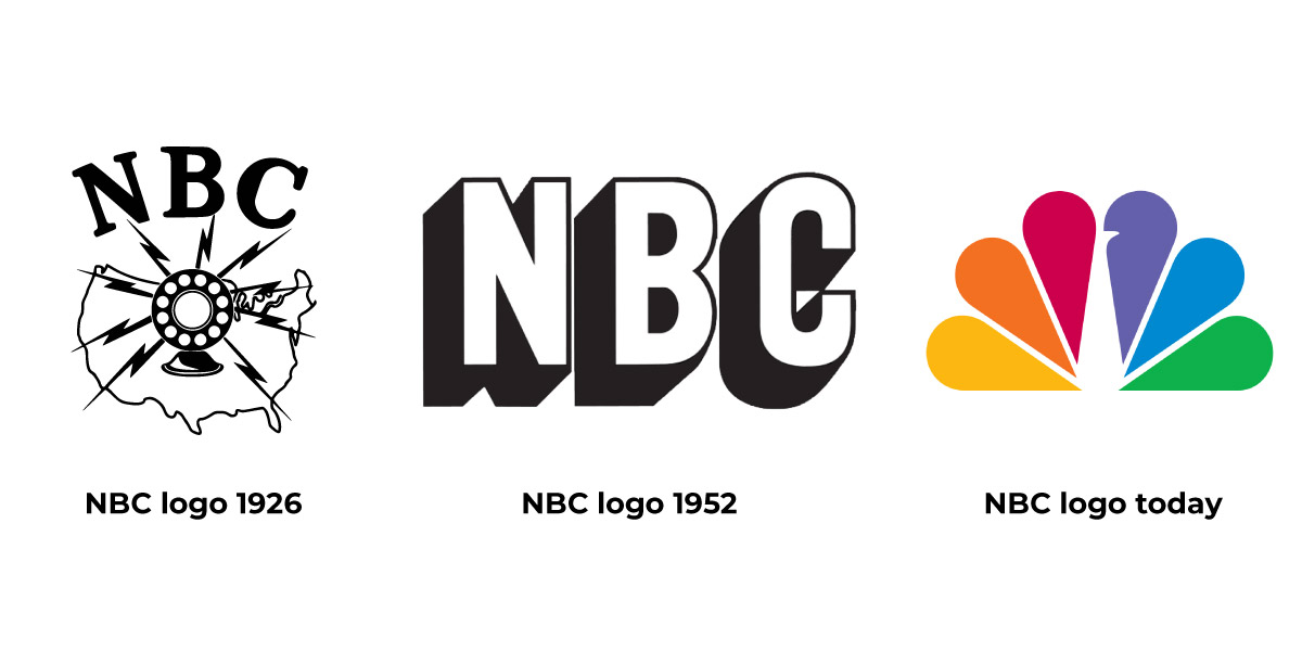
Don’t get me wrong, there are very famous brands with vibrant multi-color logos that work very well for their brand. The NBC Peacock logo comes to mind. Great logo. Iconic logo. So, why does using 6 colors (not counting black or white) work for this logo? The chief reason is that there is a sound concept dictating the use of a many-colored logo—NBC broadcasts color television programs. In this way, their use of color reinforces the core of the NBC brand. Formerly, as a radio broadcasting station and later as a television network that broadcast in black and white (in the early days of TV), their logo was much less colorful.
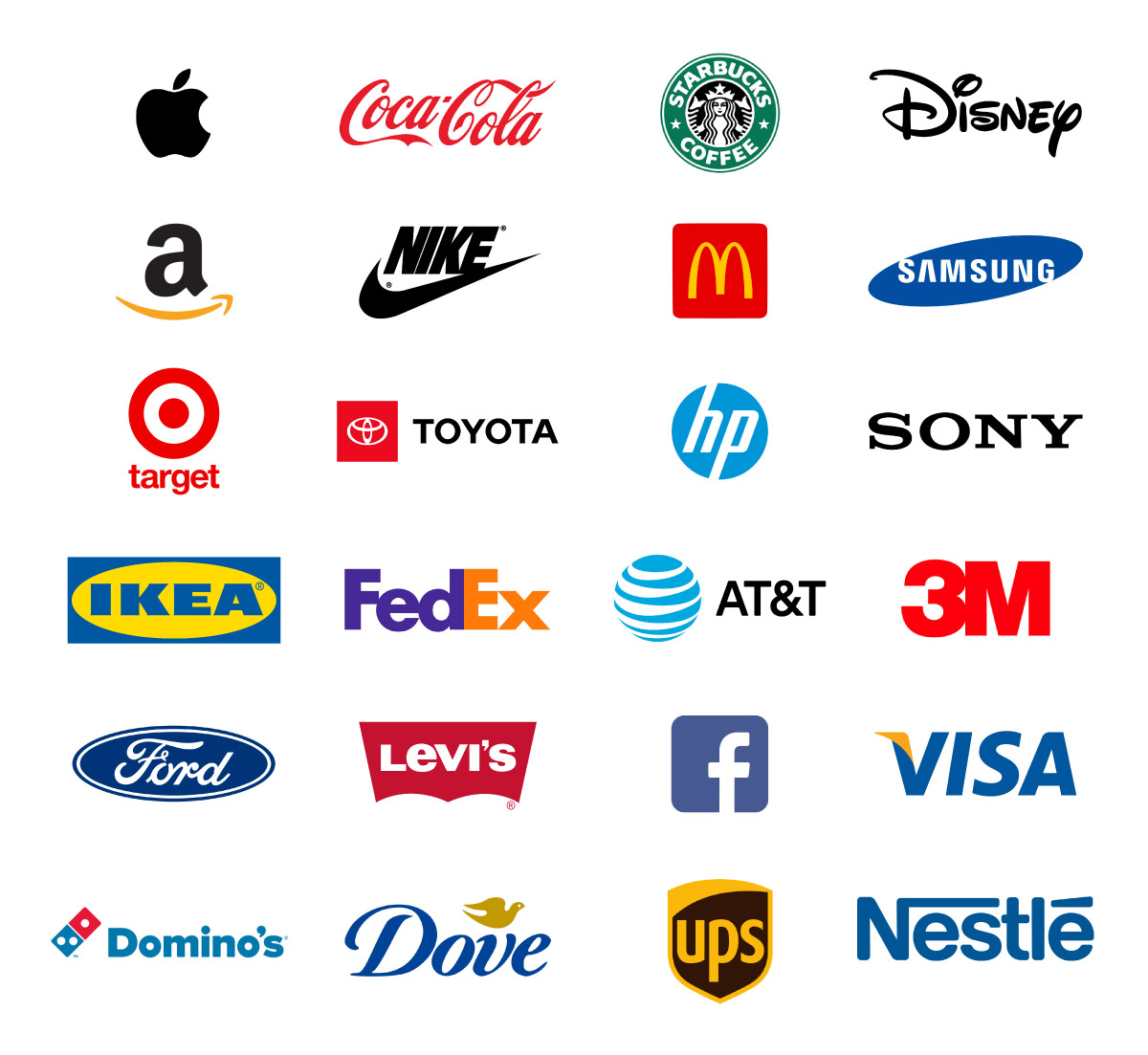
Think about the logos of major brands. It may surprise you that most big brands only use one or two colors in their logo—in fact, according to some studies, upwards of 95% of the top brands only use one or two colors in their logo designs (not necessarily counting black and/or white). But why? Because they like money more than they want to be the most “creative” kid in art class. Oftentimes people think that designing a colorful and complex logo will make their brand stand out and lead to increased sales, but big companies know through years of marketing research that smaller companies can’t afford, that simpler logos are easier to process and remember—and memorable brands are brands that sell. Just ask these major brands:
Another variable to take into consideration when choosing colors for a logo or graphic design is the psychology of color. People have instinctual and even physiological reactions to color so using too many colors can send mixed and even unintended signals. For instance, warm colors such as red, orange, and yellow are energetic hues that stimulate one’s senses, increase blood flow and metabolism and have the ability to induce appetite—ever notice how many fast-food restaurants use one or more of these warm colors in their branding efforts? Conversely, a cool color such as blue is seen as soothing and actually lowers one’s heart rate—in turn helping to curb appetite. Not only can a design easily become overwhelmed by too many warm and cool hues competing for attention, a foodservice brand especially would do well to not mix too many warm colors with too many cool colors in order to avoid sending the wrong message.
There are also physical limitations that can often make a simple logo a more effective choice for one’s logo design. Effective logos, no matter how many colors are in the palette, should be able to be represented in a one-color format without losing the recognizable characteristics of the design. Multicolor logos work best when there is some form of separation between intense colors. You often need clever placement to balance these designs effectively. Major brands that successfully use multicolored logos and graphics are able to do so because they have expert teams that carefully craft these designs using the principles of design and color theory. It’s also worth noting that, from a reproduction standpoint, the more colors that a logo has, the more costly reproducing the logo faithfully can be. Something that smaller companies should be cognizant of as they plan their fledgling branding efforts.
It’s important to keep in mind as you read this, that the design points discussed in this post are, at best, well-intentioned (and professional) suggestions. Furthermore, these suggestions are backed up by decades of research in the field of logo and graphic design. But, there are no adamant laws in design or art—merely principles. It is my ardent hope that, when one sets about branding or rebranding, they heavily lean on these principles and keep in mind that more color doesn’t equal better. Usually.


