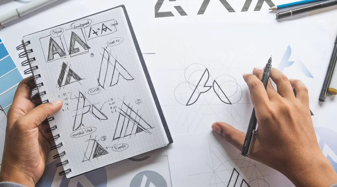
Sure, logo design is to some extent, a function of taste. But only to some extent, as there are also many technical factors involved in logo design. Inexperienced designers and especially amateur designers are often at a disadvantage when it comes to designing an effective logo—the face of your company. So, before we talk about taste, I’d like to start out with a few technical reasons a DIY logo is a bad idea.
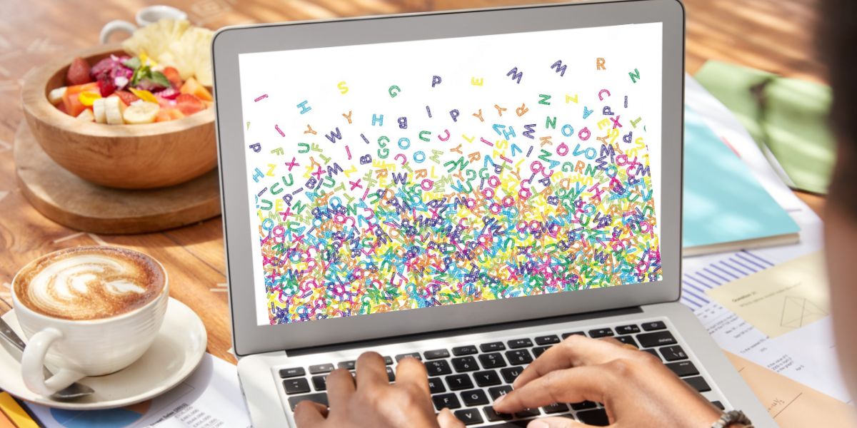
What is Graphic Design, Anyway? Learn More in Our Free ebook!
For starters, there is the issue of scalability—an aspect many inexperienced designers fail to fully appreciate. If a logo design has too much detail, particularly fine detail, these aspects of the design tend to become lost or distorted when the logo is scaled down to a small size both in print and on-screen. Since a logo’s primary function is to visually communicate a brand’s identity with clarity, having aspects of your logo that are hard to see and understand at smaller scales is a problem that experienced professional designers know to avoid.
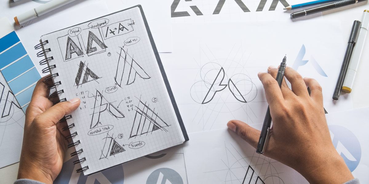
Something as important as your logo requires the skills of a professional.
Secondly, there is the issue of translatability. Professional graphic designers have experience dealing with logos and images across a variety of media. From on-screen to digital print to screen print to etching and even to embroidery (among many more), a designer needs to be aware of how brand assets translate when deployed via different media. A logo that works well as a digital print may not translate well when embroidered onto a garment. A logo that looks awesome on the computer screen may not screen print as one might want. Professional designers are not only aware of of the technical causes of these issues, but trained to work around them in order to maintain the visual integrity of your logo design.
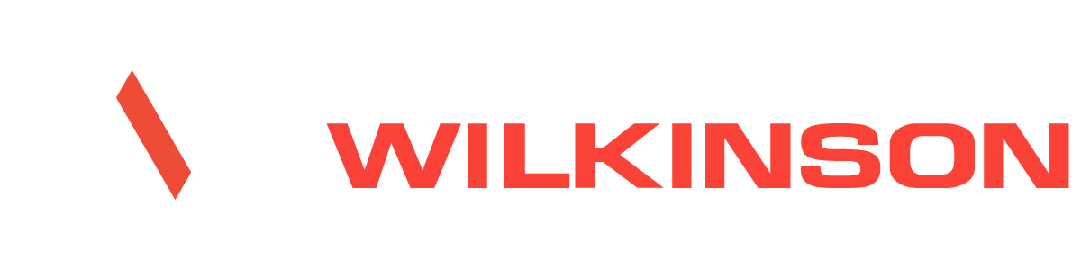
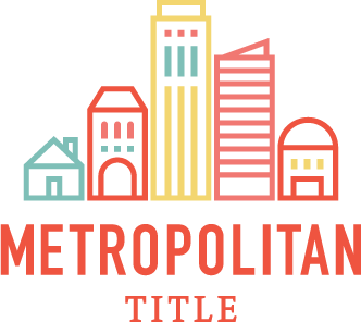 A quality logo needs to be versatile. Not only in matters such as scalability and translatability, but also in matters such as orientation and color. You may have a logo that works well as a “stacked” logo—one in which the logomark sits upon the wordmark in a vertical orientation, but a professionally designed logo will oftentimes include a horizontally oriented version of the logo—one in which the logo mark sits next to the wordmark rather than on top of or bellow.
 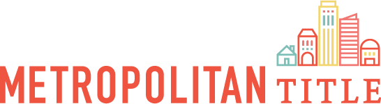 For example, horizontal logo orientations tend to work better in website headers as the amount of vertical space is restricted, causing vertically oriented logos to appear small within the restricted space.
A good logo also needs to be versatile enough to be simplified down to a one-color version of the original logo and still maintain the features that make the logo recognizable as the face of your company. When utilizing your logo online or printing it digitally, it costs nothing extra to use the full color logo but, as with many promotional items or garments you may want to print your company logo on, screen printing and pad printing processes usually charge per color. Having an attractive and functional one-color version of your logo comes in handy in instances such as these when cost may be a prohibitive factor of promoting your brand. These are things that professional designers have experience keeping top-of-mind when creating a logo.
It’s more than a matter of taste — there is psychology behind color and shape selection.
And now, we talk about taste. Look at local business signage. I’d be willing to bet that there is a noticeable difference between the look and quality of these local logos versus the look of national brand logos. But what is it exactly? Often a DIY logo will lack a tasteful font or font combination. An amateur designer may not be aware of which fonts are considered overused, cliché or just plain out of fashion. Also, amateur designers most likely will fail to take the psychology of color and shape into account when designing a logo. It’s not uncommon for someone who is creating their DIY logo to simply pick a “cool” font and pair it with their favorite colors. While this will be amusing to the DIYer, professional designers know that we have psychological responses to color and shapes. Warm colors such as red and orange are colors that increase appetite, while we associate blues and greens with health. A square logo will give your company a sense of weight and stability, a triangular logo gives the impression of power, and a circular logo can give a sense of unity.
So, if you find yourself in the position of needing a corporate logo, remember that your logo is the face of your company. And, as such, a professional designer can help bring your corporate culture and values to life in a meaningful, scalable, translatable, versatile and tasteful way.