
The em dash is a punctuation mark so versatile that it can easily be used in place of commas, parentheses or colons. But, why have so few people heard of it—and why is it so underutilized? The answer, I fear, lies in ignorance. So, let’s get started.
The em dash is named thusly because it is a dash roughly the width of the capital M character in a given typeface. There is an example of an em dash in the first paragraph. An em dash most commonly denotes an aside—or an extra bit of information—that is inserted into a sentence. But, the wonders of the em dash don’t stop there! In addition to information that would often be encapsulated by commas or parentheses, the em dash can also be used in place of a colon—as shown in the title of this blog. This usage of the em dash emphasizes the conclusion of your sentence. Finally, a lesser used form of the em dash is the multiple em dash. Two or more em dashes can be used to indicate parts of a word that are not known or intentionally left out—as with court case reporting in which the parties are to remain anonymous. Example: Mrs. R—— testified that the accused called her b—— during the alleged assault.
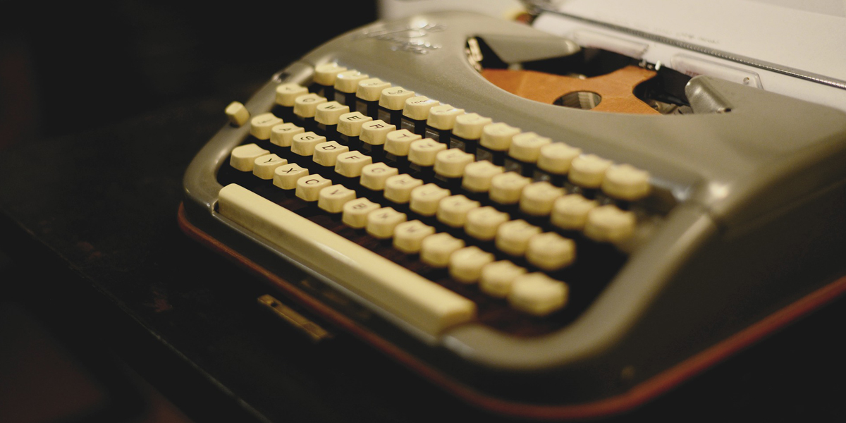
When using a typewriter you can use two dashes to represent an em dash.
Even when em dashes are employed in writing, they are often misused. Em dashes don’t require a space on either side as the proper amount of spacing is already coded into the typeface. If you are using a typewriter, using two hyphens instead of an em dash is acceptable. Which brings me to my next point. Why do I keep seeing the two consecutive hyphen convention in place of an em dash on digitally typeset documents and articles—with a space on either side of the double set of hyphens no less? I can only assume it is ignorance of the proper punctuation convention—and what’s worse, it appears to be proliferating.
When I see a double hyphen — especially with spaces on either side — I automatically think of it as amateurish typesetting. Furthermore, even though newspapers generally use em dashes, those publications that follow the AP style inexplicably often include a space on either side of the em dash. Sadly, I can see how this may add to the confusion on how em dashes should be used by journalists—digital or otherwise. It is also worth noting that some editors hate or even ban the use of em dashes as they are very easy to overuse in one’s writing—much like the tongue-in-cheek overuse of em dashes in this post.
To conclude, I urge you to practice using proper em dashes rather than the increasingly ubiquitous typewriter convention of space two hyphens space. It looks more professional and em dashes are readily available on most word processing applications—some will even automatically add the em dash in place of a pair of hyphens. On Microsoft Word and Microsoft OneNote, you can find the em dash in the insert symbol dropdown menu, while the em dash can be found in InDesign under the Type dropdown menu. Type>Insert Special Character>Hyphens and Dashes. I know this post won’t stop the use of double hyphens in typesetting, but it is my earnest hope that it can possibly slow the spread of em dash misuse. It’s a handy bit of punctuation and deserves our respect.