
Simply put, branding professionals are charged with the task of building relationships with a given audience. It’s their job to create, strengthen and communicate, largely visually, a company’s value by establishing a brand identity through various marketing efforts. Though there are many deliverables associated with branding, one of the primary focuses of branding and marketing efforts is logo design—a process by which creative experts attempt to convey messages, ideas, and principles representative of the brand in the simplest possible form.
>>Check Out Our eBook SO…WHAT IS GRAPHIC DESIGN ANYWAY?<<
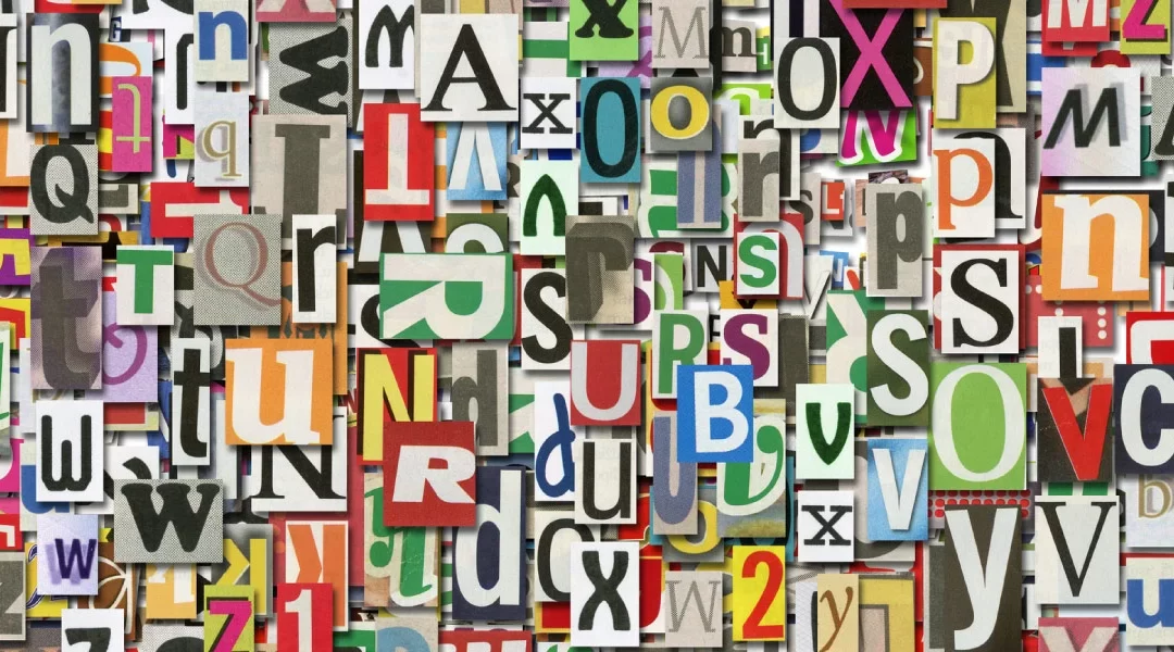
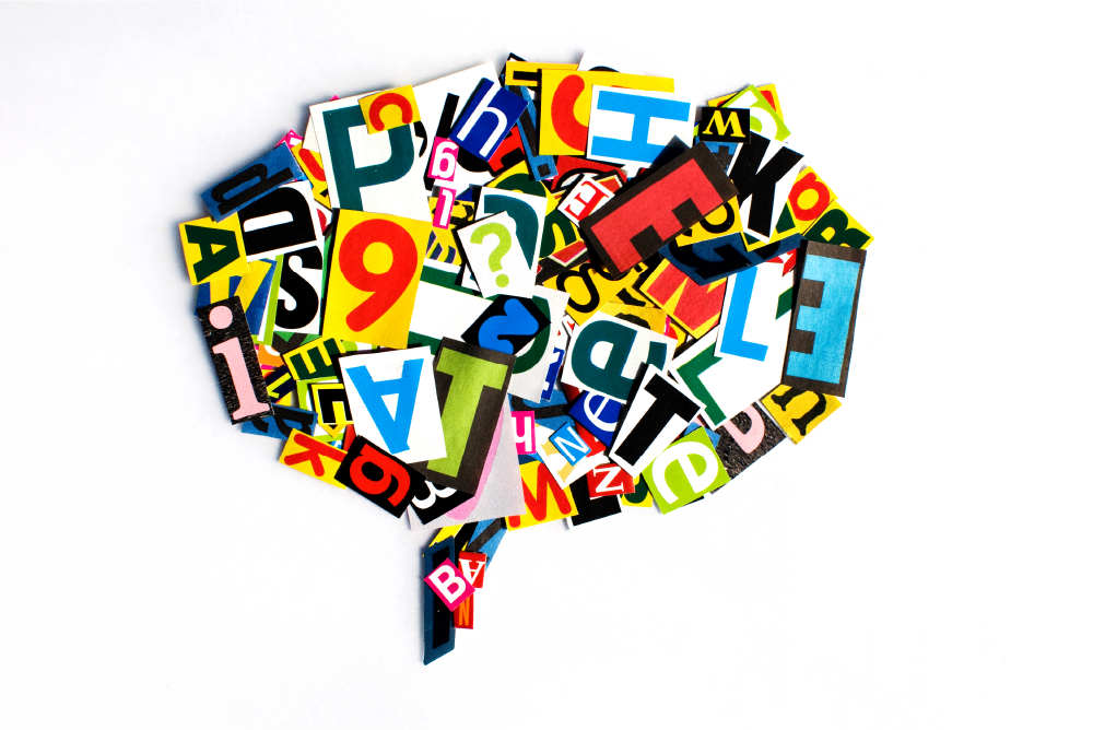
Just about everyone at one time or another has looked at a logo and wondered why a particular font was selected to represent the brand. Most people are aware that there are certain emotions attached to certain colors – for instance, there’s an entire musical genre called the blues. But we also attach feelings to shapes and, since fonts are essentially a collection of shapes, we also instinctively feel a certain way about certain fonts. It’s for this reason that branding professionals are careful to select fonts that they feel will do the best job at communicating their message, whether it’s their logo design or other branding efforts.
The font you choose can say a lot.
A 2006 survey of over 500 people conducted by Wichita State University sought to establish which emotions are associated with a wide array of commonly used fonts and font classifications: serif, sans serif, script, monospaced and display fonts. Serif fonts were found to be perceived as stable, practical, and mature. Sans serif fonts were rated a neutral, not seen with positive or negative connotations but are generally associated with simplicity, cleanliness, and modernism. Script fonts were seen as feminine, humorous, and informal. Monospaced fonts were regarded as dull, simple, and unimaginative. Display fonts gave the feel of masculinity, assertiveness, and coarseness. So, when selecting a font for your brand, think about what values you are trying to express and choose accordingly for maximum impact—it’s so much more than simply picking a “cool looking” font.
Another study, conducted in 2014, found that people perceived tasks as difficult to achieve if the written instructions were typeset in a hard-to-read font and a 2008 study similarly concluded that people who were given difficult-to-read instructions felt the prescribed task was more time-consuming than it actually was. This phenomenon is known as cognitive fluency—the theory that tasks seem more challenging when our brains have difficulty processing the information associated with said task.
So, though it may seem counterintuitive to your branding efforts, it’s more important to make sensible font choices than it is to be completely original. Be aware of the impact that font choice has in setting the tone for your brand. Don’t outsmart yourself and, as the old adage goes, keep it simple…well, you know the rest.


