

Back in October 2019, I wrote a blog post entitled 5 Graphic Design Conventions That Annoy Me to Death that focused on my annoyance with “tacky” design conventions. Since then, it has been the top Google result for the admittedly narrow search term “annoy me to death.” That fact, combined with my everyday rosy disposition, has earned me the reputation of my company’s resident Andy Rooney (Google it kids).
What Data Matters to Your Web Traffic? Click Here to Learn!
Naturally, I’ve wondered what would have happened had I written a blog post with a more positive spin? Would Google see fit to also rank it highly? Would I be known as my company’s Ryan Seacrest? Would people magically start pronouncing GIF correctly? Would the world finally discover the usefulness of properly utilized Em dashes? Well, enough with the questions (quite frankly they annoy me)—this blog post will serve as an A/B test of sorts. So, without further ado: 5 Graphic Design Conventions I Absolutely Adore.
Minimalism/Simplicity
Truly, less is more when it comes to most graphic design projects. Minimalist composition eschews excess (read: unnecessary) components, features, and elements in favor of prioritizing essential elements. People often fall into the trap of judging minimalism as a boring design convention that lacks excitement but, when employed properly, it is a beautiful design philosophy indeed. Is the hallmark of The Mona Lisa its complexity? I would argue that its power comes from its delicate grace and balanced composition—from its beautiful simplicity.
While non-minimalistic design can be visually impressive at first blush (surely complex designs must take more time and talent), complex designs are often hard to quickly decipher. If a website user can’t promptly intuit your site’s navigation, they are likely to end their session before achieving the desired result. If your logo is jammed full of unnecessary elements, your brand’s message will literally get lost in the clutter.
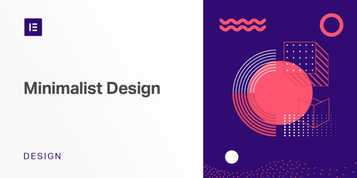
Fig. 1 Minimalist designs can also be visually interesting and beautiful despite lack of literal detail.
(Courtesy of elementor.com)
Flat Design
An extension of minimalistic philosophy, flat icons, logos and illustrations work well to lend tastefulness to your design projects. Flat design invokes a clean, modern aesthetic that allows users to clearly focus on content. Gone are the tacky drop shadows, highlights and textures that attempt to communicate a three-dimensional effect. Instead, flat design attempts to reduce design elements to their simplest, most universal forms. In this way, flat design is ideal for icons, logos and illustrations that will be used at multiple sizes across multiple platforms and media. Seemingly restrictive, clever flat designs can create the illusion of dimensionality even without the use of conventional shading and highlights.
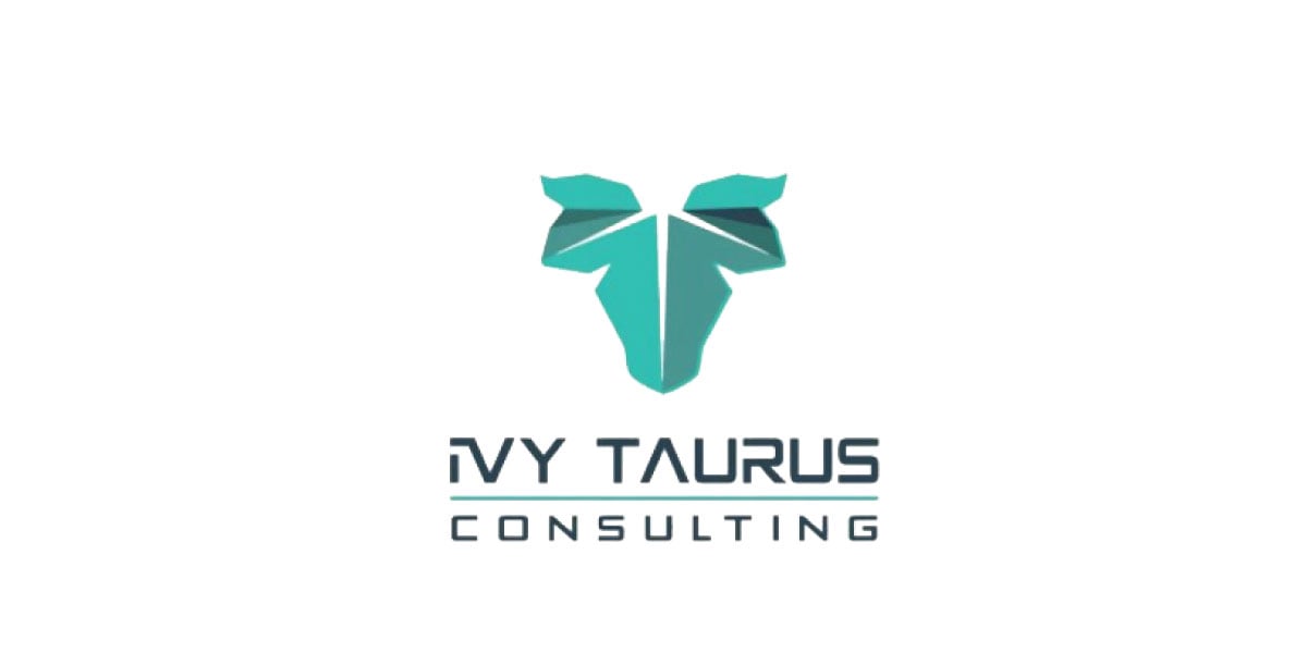
Fig. 2 This flat logo design creates a sense of dimensionality without using conventional shading.
(Courtesy of Neatlines)
Geometric Typefaces
Geometric typefaces, whose design ethos was heavily influenced by the Bauhaus designers of the early 20th century, are (generally) sans serif fonts in which basic geometric shapes such as circles, squares and triangles play a primary role in the design of the letterforms. Having little to no contrast in line width, geometric typefaces have a modern and cohesive appearance making them ideal for contemporary design. I’ve personally found geometric fonts to be extremely versatile—making these typefaces ideal for many of my projects. They lend themselves well to logo design for any number of industries, they often display well as web fonts and they can be used effectively as display fonts and copy fonts depending on the weight used.
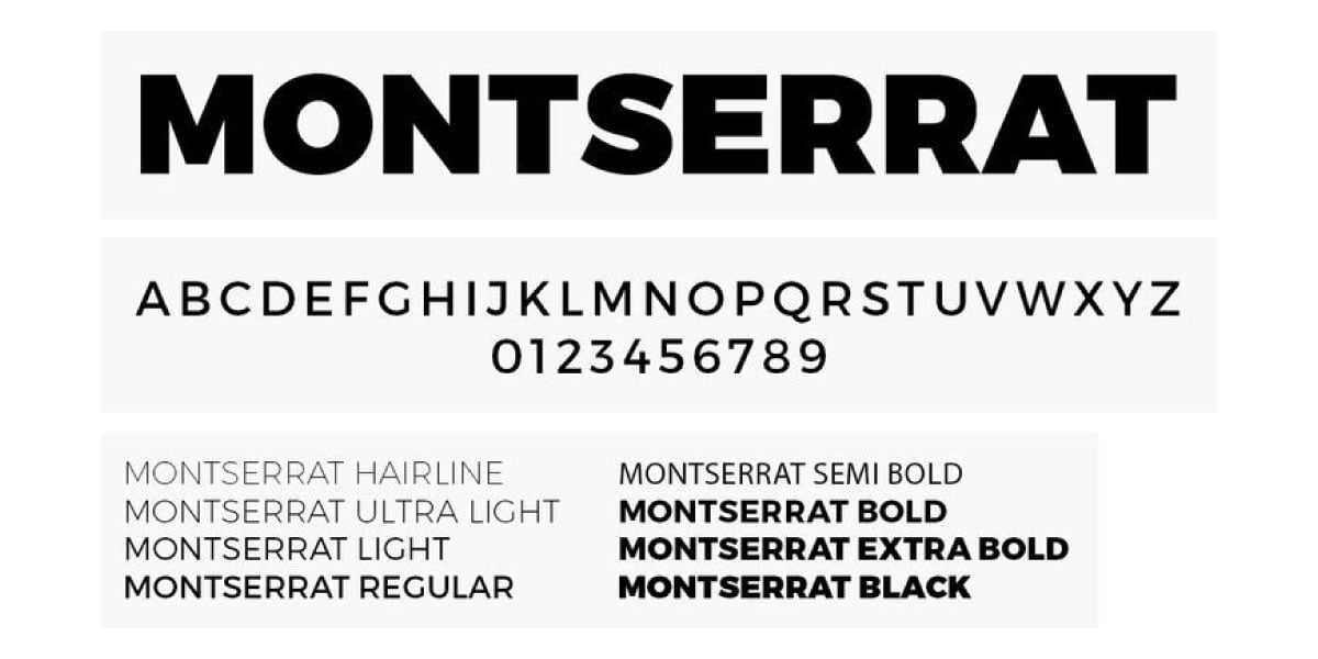
Fig. 3 Montserrat is a go-to typeface for many of my projects.
White Space
Referred to as negative space by fine artists, white space isn’t necessarily the color white. White space is the area(s) within a design that doesn’t have text or images. In short, white space is the background of a design. Seemingly unimportant, whitespace is utilized to prioritize eye flow, create groupings by emphasizing foreground elements and even improve legibility. Also related to the less is more approach, utilizing white space within designs is an important tool to avoid visual clutter and keep compositions from looking over designed thus making for a more easily conveyed message.
There are two categories of white space: active white space and passive white space. Active white space is negative space that is intentionally and consciously built into a design in order to add emphasis and structure. Passive white space is naturally occurring space that is inherent in the area between words and letterforms as well as the space surrounding graphic elements such as logos and icons.
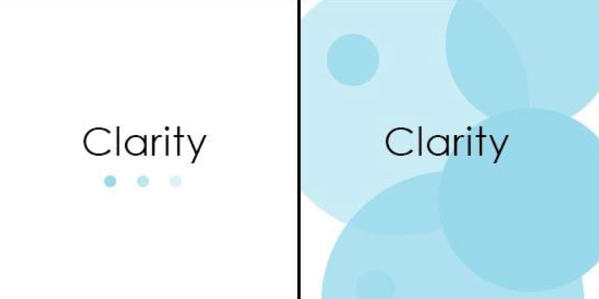
Fig. 4 Ask yourself—which design provides more clarity?
(Courtesy canva.com)
Creative Typographic Arrangements
An emerging trend (though not a new concept at all), creative typography treats the letterforms of readable copy as part of the creative art/design itself. Creative typography breathes new life into these symbols that we read every day and thusly take for granted by arranging them in new and unexpected ways. No longer relegated to just a functional convention, creative typographic breaks letters out of their box and lets them become tools of expression through the use color, size variances and engaging placement choices.
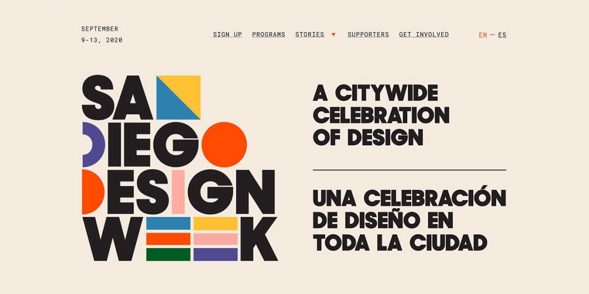
Fig. 5 This design is interesting and more fun to read because of its creative typography.
(Courtesy of designshack.net)
There you have it, the five graphic design conventions by which I live my life. Subject to change, as design is an ever-evolving discipline, much of the above are tried and true principals of design that don’t simply change with the seasons. Although not every designer will agree with this list—as we speak there is a growing rebellion against flat design—it is important to keep in mind that however trivial a design detail may or may not appear to be, good designers have their reasons for doing what they do.


